Uniquely Rice
Rice University was several months into the project to redesign its alumni website when critical staff members took positions elsewhere. While they found replacements, Rice hired Gardner Loop to manage the project and to create the site’s new design.
Research and Strategy
We began by getting to know our collaborators: four departments at Rice and three third-party vendors. Once we were familiar with our partners and the roles they would play, we turned our attention to the site itself. We took stock of existing content and technology and used analytics to help us understand how Rice graduates used the site.
With an understanding of the site’s past, we began envisioning its future. We developed content strategy and information architecture, reorganizing existing content and planning for new content. We visited the campus, spending two days talking to students and staff about Rice’s history and architecture. These pieces came together to inspire four unique designs.
Designs
With a bevy of photographs from our campus visit, we had more than enough inspiration for the design portion of the project. Rice’s campus is beautiful and the buildings share common architectural features such as arches, round ornaments, and decorative brickwork. We knew some of them would appear in our designs.
Blue & Gray
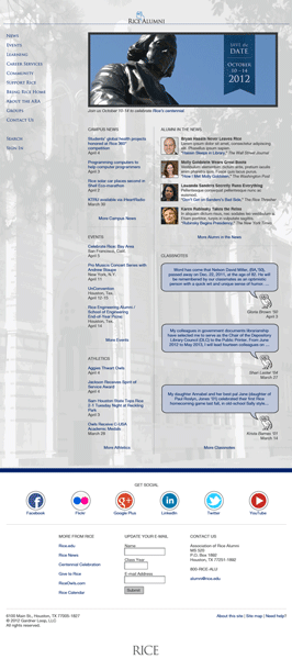
This design focuses on presenting the content in a simple, straightforward manner. The Rice colors, for which the design is named, are prominent. The gray background image began as a color photo of Lovett Hall, an iconic building with special meaning for Rice graduates.
Many of the buildings on campus had round, colorful ornaments on their exteriors. We modeled social media icons after those ornaments and used them in all of our designs.
Lovett Hall is, as Nick puts it, “deceptively asymmetric.”
For instance, where one end of the building has pairs of windows, the other has windows in sets of three. The content is laid out in columns with unequal widths to reflect the asymmetry in Lovett Hall’s facade. Like the round ornaments, asymmetry inspired elements in other designs as well.
Engagement
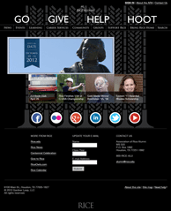
The goal of this design was to draw readers past the home page and into the site as quickly as possible. In addition to a navigation bar with the typical set of links, we added a larger, more visible set of links that leads to popular tasks. We pared down the amount of content — this design has five highlighted items instead of the 10-20 items in the other designs — and made the social media icons larger. The idea behind all of this is that, once a person gets moving past the home page, he or she is set on a path to engage with the site and consume content.
Again, campus architecture figured heavily in the design. The brickwork pattern behind the content is an illustrated version of the pattern found on the north facade of Sewall Hall (a building that lines Rice’s academic quadrangle). The feature photo is set off to the left of the items below it to reflect Lovett Hall’s asymmetry.
Minimal
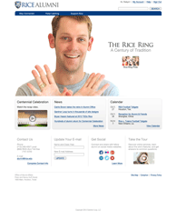
During one of our conversations with a Rice staff member, she commented that she loved the simplicity of Apple’s website, but didn’t think Rice could get away with something like it. This design was our attempt to prove her wrong.
Because of the intended simplicity of this design, we decided to rely on a few design elements from the main Rice website to give it that Rice look and feel, rather than taking inspiration from the campus architecture.
What’s Happening?
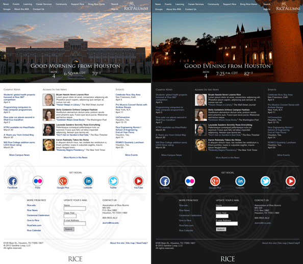
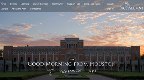
Although most graduates leave their alma maters after graduation, their experiences are repeatedly relived by each new class of students. With this design, we sought to take advantage of those shared experiences as a way to engage alumni online. “What”s Happening” would give Rice alumni a look into what students were doing on campus every time they visit the site. The large photo at the top of the design would change based on the seasons, the time of day, the occurrence of a major event, and so on, so that the site would give an accurate depiction of something happening on campus at the same time a person is using it. In addition to the changing photo, the color scheme of the site would change.
Architectural inspiration appears again in this design. The social media icons are the most obvious example, but we also incorporated arches and a stonework monogram. Taken together as a shape rather than lines of text, the content in this design (from the bottom of the large photo to the content just below the social media icons) forms an upside-down arch. The monogram illustration — “WMR” for William March Rice, the university’s founder — is an drawn version of a stonework monogram found in Lovett Hall’s Sallyport Arch. The monogram appears lightly behind the social media icons and footer.
“Let me just say WOW! Beautiful!”
Robyn Blackmon
Director of Communications
Rice University